Mini Window
The mini window is another flavor of a browser window. It stays always on top, opens at a smaller size by default, and has a simplified toolbar.
There are two types of mini windows:
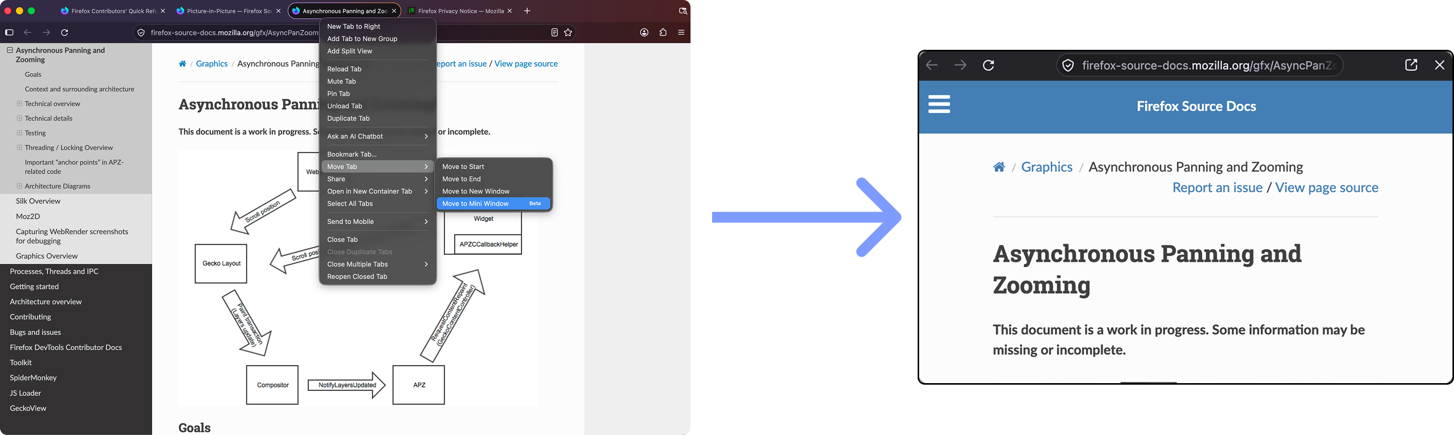
Full tab: This case involves moving a tab into a new always-on-top window with the mini window toolbar.
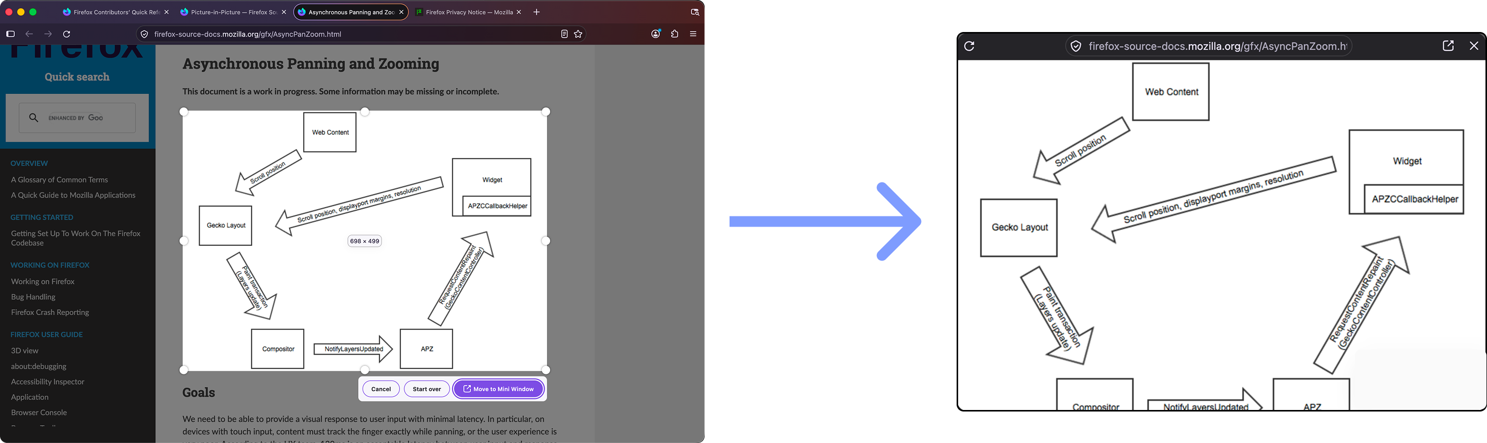
Fragments/cropped: This case allows the user to select a section of any webpage and view it in an always-on-top window. The selected section scales as the window is resized, and the user can pan around and interact with the page as usual. See Fragment Mini Windows for more details.
Architecture
A lot of the mini window’s architecture follows Picture-in-Picture.
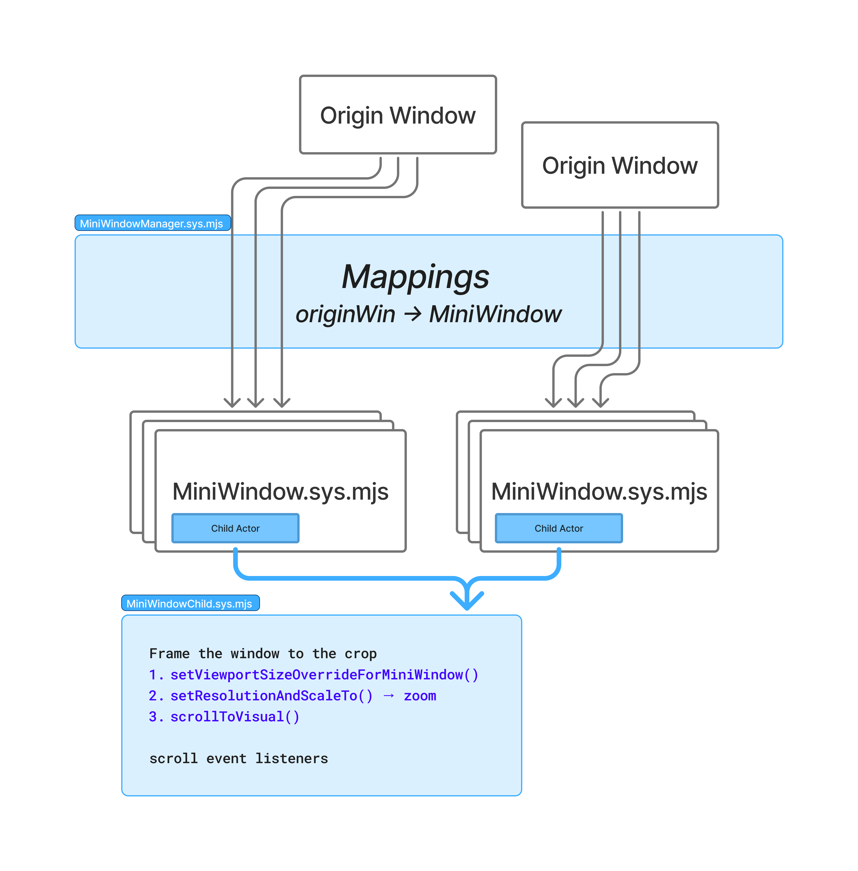
MiniWindowManager keeps track of each originWindow (the window a tab came
from) and its MiniWindows.
The MiniWindow parent actor decides when to show or hide the toolbar, based
on scroll events it receives from the child actor. Note: this is a potential
piece of code to improve! We could potentially share some of the logic with the dynamic toolbar on mobile
and apply it here to make for a smoother UX experience.
The child actor has a lot more responsibility. It frames the document in the window so it matches the crop; see Fragment Mini Windows.
Fragment Mini Windows
The goal is to let the user focus on a section of a webpage and keep that section visible as they resize the window.
The process starts with a selection screen, using the Screenshots selector in mini-window mode (see modes). The user can select any region of the page. We then use the selection’s position and dimensions to:
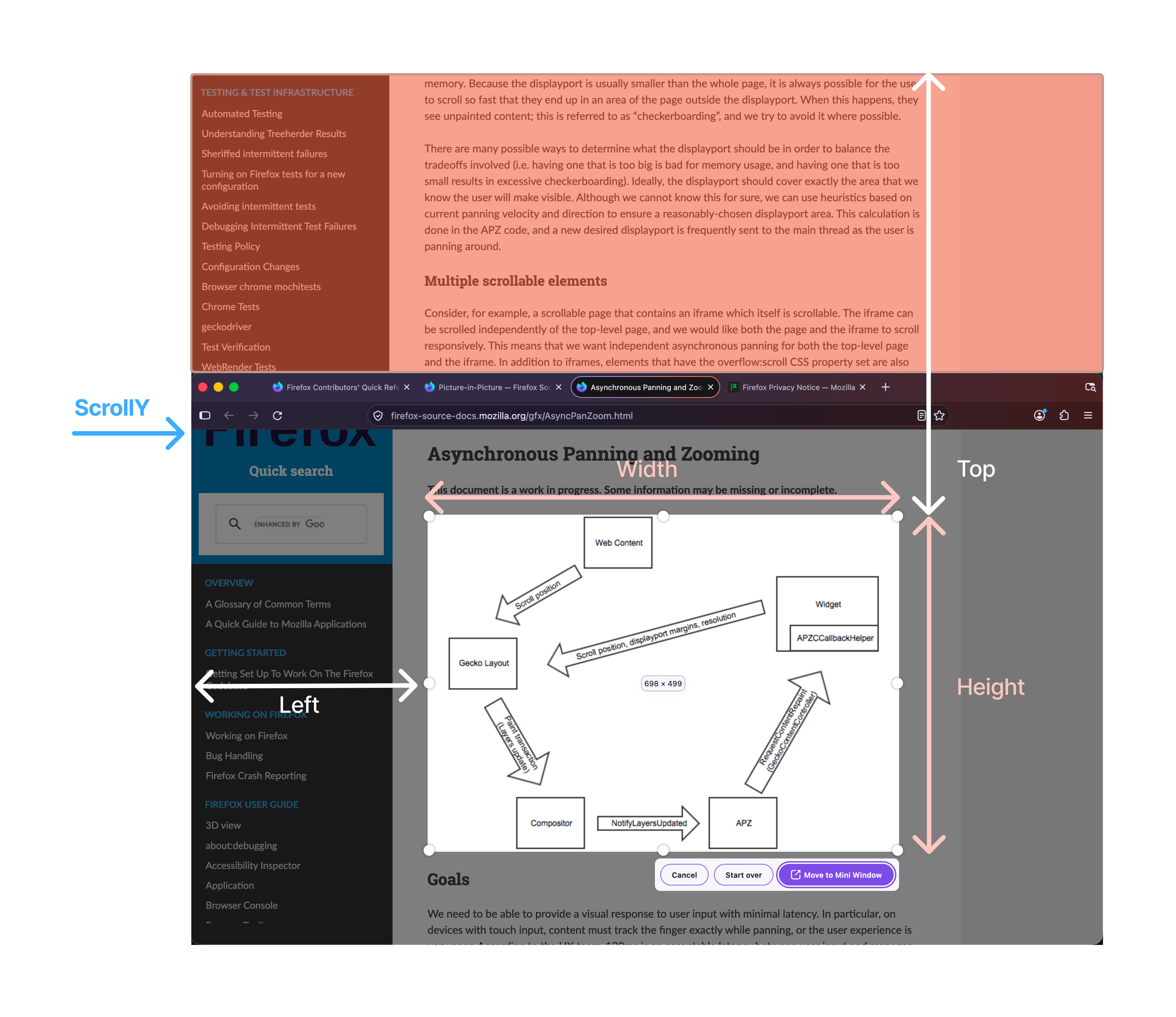
Collect the selection (
left,top,width,height) and the origin tab’s viewport size (innerWidth,innerHeight).Move the tab into a new window using
replaceTabWithWindow(), sized to the selected region’swidthandheight.Use APZ to frame the selected region within the visual viewport.
The APZ framing has these steps:
Override the Layout Viewport to the viewport size in step 1. This sets the
ViewportSizeOverrideForMiniWindowproperty on the Document. The page then lays out exactly as it did in its origin tab.Adjust the zoom so that the crop fills the window’s width.
Scroll to the section of the page the user was on using
leftandtop.
Resolution
The crop is framed by setting the APZ resolution (zoom) so that the crop’s width fills the mini window:
newResolution = (visualViewport.width * currentResolution) / crop.width
visualViewport.width is the visible width in CSS pixels at the current zoom,
i.e. the window’s visible width divided by the current resolution. Multiplying
by the current resolution undoes that, giving the visible width at a zoom of 1.
Dividing by the crop’s width then gives the zoom at which the crop exactly fills
it.
For example, with a 300px wide window and a 150px wide crop:
visualViewport.width is 300 at a resolution of 1, so the new resolution is
300 * 1 / 150 = 2, and the 150px crop fills the 300px window.
Resizing
Since we’re using the MobileViewportManager and the layout viewport is fixed to
the override, resizing the window never reflows the page. Instead the
MobileViewportManager scales the zoom with the window, in
MobileViewportManager::UpdateResolutionForViewportSizeChange searchfox.
On a resize, MobileViewportManager::RefreshViewportSize searchfox computes how much the
window’s width changed (the display width change ratio, new width / old
width). The CSS viewport doesn’t change, since it’s fixed to the override, so
UpdateResolutionForViewportSizeChange multiplies the current zoom by that
ratio.